Boop is a mobile app that helps busy users reconnect with friends new and old. Keeping in touch with friends and family can be hard, even with a million ways to connect. We provide smart reminders, discussion prompts, and even conversation guides for the tough topics, empowering millennials to grow, strengthen and heal relationships in
their life.

My ROLEs
UX/UI Designer,
Visual Designer,
UX Researcher
Conducted exploratory user interviews, collaborated on research synthesis and persona creation, illustrated storyboard, sketched lo-fi wireframes, created mid-fi wireframes, conducted user testing, developed brand logo and visual design, created hi-fi prototypes in Figma
Duration
3 weeks, September - October 2020
TEam
Thea Pajunen (PM)
Andrew Dawson
Nick Pugliese
David Ciccocioppo
Tools
Mirro, Whimsical, Figma, Illustrator, PhotoShop
Background
Studies have shown that social connection improves physical health and mental and emotional well-being. Data from experiments published in the journal Science suggest that social isolation is a major risk factor for mortality from widely varying causes. So the argument can be made that we can live longer by maintaining positive interactions with the people around us.
The more we get lost in our virtual connectivity, the more we could be losing out on real connection—the kind of connection with our friends and social groups that can lead to improved mental health, and overall happiness. Boop was designed to help facilitate this kind of connection.
Objective
In order for our users to achieve greater emotional health through connections with the people that are important to them, our group set out to create a solution that would allow busy people to remember the importance of true connection and to take action.
Empathize/Research
In order to gain insights around the way people communicate we conducted an online survey and found that only one quarter of our respondents felt that they communicated enough with people. Most people felt that they could be doing a better job of reaching out.

We also found that most of these people use digital tools, such as an agenda or calendar to keep track of events and appointments. From this data, we began to make the assumption that a digital tool could help users achieve their goals of reaching out more.
Qualitative interviews helped us identify the ways in which people make casual connections with the people they care about, understand how these interactions make them and the person they are reaching out to feel, and determine whether or not they could use help remembering to make these connections.
“I've definitely been guilty of ghosting”
“It's hard to keep up with all your friends all the time”
“Texting… t's very, very easy to ignore and put off”
Our Persona
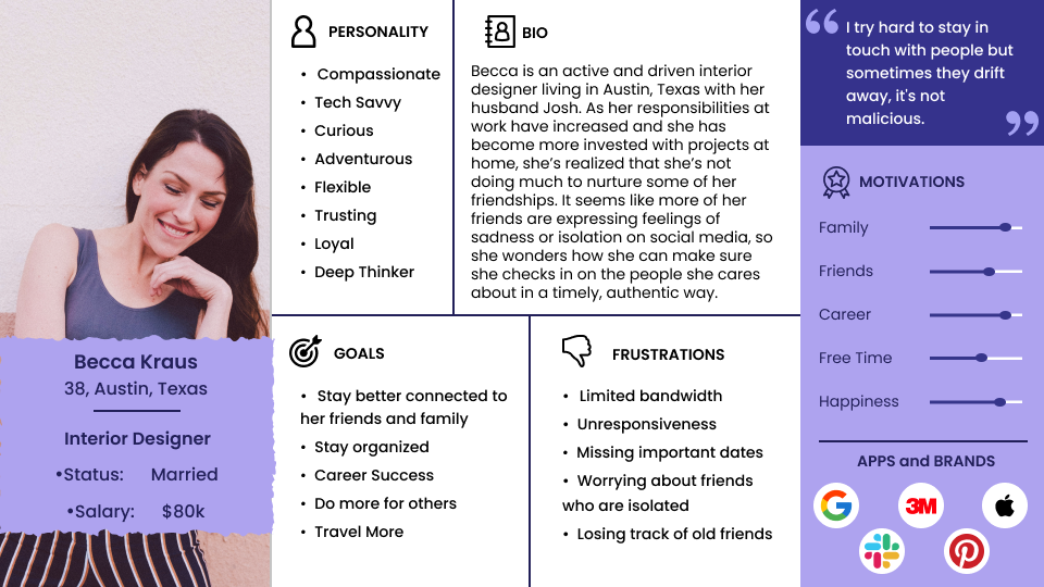
Becca is a 38 year old interior designer living in Austin who is married and makes a pretty good living. She's a compassionate and loyal soul who wants to stay better connected to her friends and family. The trouble is that she has taken on more tasks at work, and has become more invested in projects at home with her husband. As a result, she feels like she is losing touch with friends, missing important dates in their lives and worrying that they might be feeling isolated. She herself may also be feeling alone and isolated in her own busy life.

UX Hypothesis
We believe that helping busy people on the go make connections with the people that matter most will give them an emotional lift and alleviate feelings of isolation.
We are designing an app to help busy millennials connect and strengthen relationships and increase happiness. Our research showed that building connections in your life improves overall health and alleviates symptoms of depression.
How might we create an app that provides the tools necessary to facilitate relationships that provide an emotional lift for
both parties?
Ideation
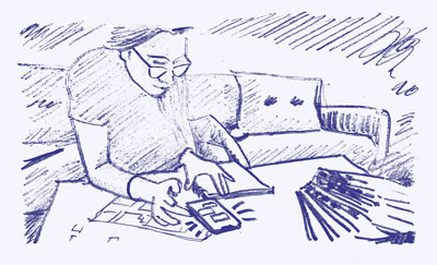
Here’s how Boop would help Becca achieve her goal of reaching out regularly to help her feel connected and content.


called Boop.


Prioritizing Features for an MVP
We prioritized features to include in our initial launch by crafting “I like, I wish” And “What if…” statements from our research insights and chose to focus on three key features.
- Reminders
- Resources
- Gifts

Value Proposition Statement
Boop is a mobile app that helps busy users reconnect with friends new and old. Keeping in touch with friends and family can be hard, even with a million ways to connect. We provide smart reminders, discussion prompts, and even conversation guides for the tough topics, empowering millennials to grow, strengthen and heal relationships in their life.
Prototype
We took a divergent approach to our user interface, by independently wireframing our own interpretations of how the navigation and key features should be presented. From here we aligned on the best solutions and an ideal wire-flow to develop into a mid fidelity prototype.
 Click for Mid Fidelity Prototype
Testing
Here are some key findings from our mid-fidelity prototype testing.
- Users wanted the ability to connect the app to their phones contact list so they could add friends easier
- Language on the menu and guide portions of the app needed to be clearer and more recognizable still
- This app could be very helpful even outside of our proposed user group possibly for customer relationship management and for people on the Autism Spectrum
Visual Design
Our visual design approach focused on simplicity and a fun and friendly UI that would encourage regular use. We were able to source illustrations that worked well with our look and feel, and helped carry the friendly and inviting style throughout the experience.
 Click for Style Guide
We wanted give the user control by giving the ability to add select contacts from their phone and set reminders to contact them using a simple, intuitive, and calendar free user interface. Becca has enough calendars to manage so we did not want to introduce another one into her busy life.
Because Becca is so busy, we included some relationship building resources that help her overcome various friendship blockers. The gift section will be the main revenue source for Boop and is the place that Becca can send thoughtful presents to her friends.
We designed dynamic notifications that not only prompt the user to reach out to their friends, but also recommended resources and updates on our gamification which rewards Becca when she hits certain benchmarks. Our watch app mirrors these notifications, and reminds Becca when she hasn’t reached out recently.

Takeaways
Some decisions, like choosing to not implement a more exciting interface design, are tough but necessary when time is limited. Making that decision quickly and without getting too sentimental was critical to meeting our deadlines.
There will always be debate about how much or how little you tell your user about your brand. Trust your gut and get the product out the door.
A simple experience is a better experience. One key feature executed well is better than a lot of features no one really asked for.
An intuitive UI beats a lengthy onboarding process any day.
Next Steps
Seek out a mental health organization whose mission is complementary to ours to form a partnership. The goal of this partnership would be to reinforce our legitimacy as a mental
health aid.
Continue develop and test the reward badges to determine if gamification helps our user meet her goals or detracts from the experience.
A simple experience is a better experience. One key feature executed well is better than a lot of features no one really asked for.
Shop the app to potential gifting partners to begin to understand its value from a monetization standpoint.
